Guide to onboarding UX patterns & which one is right for you
Focusing on onboarding is critical to the health of your product. In this fleeting first impression, your product needs to shorten users’ time-to-value, get them to that ‘aha moment,’ strengthen your brand, and do it all fast!
There’s deep psychology involved — ‘Do I motivate with a carrot, or a stick?’
There’s emotions to consider — ‘What does a user feel in the first 5 seconds?’
There’s context to design around — ‘What if they came through a paid ad vs organically?’
There are many ways to do it right, but which one is right for you? Here is a list of some UX techniques that my team recently researched. We found it helpful to ask ourselves about the pros and cons of each one, why or when to use each one, and to review examples. By the end of reading, you’ll probably come to realize that a combination of a few of them are the best solution. They are ranked in order from simplest to most complex.
In order from simplest to most complex:1. First-look tour
2. Walk through tour
3. In-context tooltips
4. Blank slate tips
5. Demo content
6. Touchable video
7. Checklist
8. Simulation
9. Self Segmentation & branching
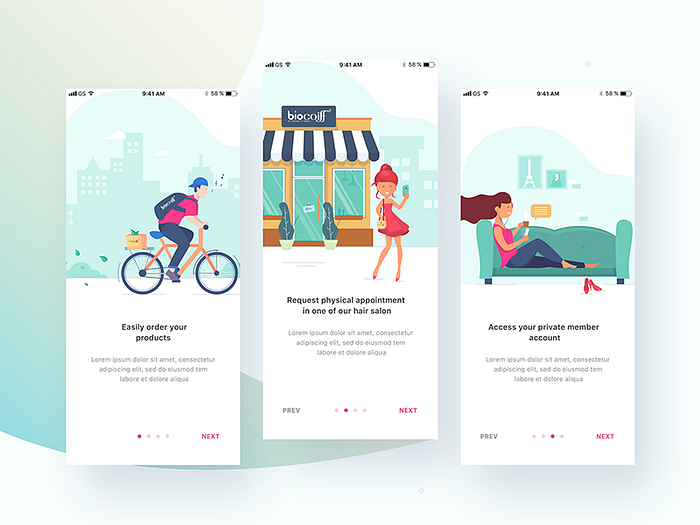
1. First-look tour
What is it? This is the most common technique. It’s your ‘first line of defense’ and is often used in congruence with other techniques. It’s a series of screens that sit as an overlay, over your product. It’s best used to communicate higher level value and not specific features; and often used to just say ‘welcome’ or to explain the overarching layout. It’s great for mobile.
Pros: It’s easy, you can use a 3rd party like Appcues, Chameleon, or Userpilot, and constantly iterate. It’s a great branding opportunity. It’s easy to implement on mobile.
Cons: Most users click right through it, then once they’re in the product they think, ‘wait..I needed that? where is it now?’

2. Walk through tour
What is it? A slight upgrade from a first-look tour — the only difference is that the modals are pointing to the parts of your app that they are referring to. For this reason, the value being expressed in each modal should tie directly to an interface element. It’s usually used to take users through a set of actions step-by-step that they need to take to achieve a specific outcome.
Pros: You can also make these quickly in Appcues, Chameleon, UserPilot, or others.
Cons: They’re just as dismissible as the first look tour, but that’s not a reason not to do it.

3. In-context tooltips
What is it? As opposed to a ‘first look’ experience, these tips appear as the user explores the product (feature by feature or view by view). Each tip is offered as a one-time dismissible modal that can either explain the value of that feature/section or explain how to use it. This technique waits for the user to take an action and presents the value right then and there. Similar to the tour, it is usually implemented as an overlay or modal.
Pros: The tooltips are in-context, so it solidifies the feature-value pairing, reducing cognitive load. This can also be created with 3rd parties like Appcues or Chameleon.
Cons: Some might never get discovered.


4. Blank slate tips
What is it? Think of every not-yet-populated section/view of your product as space to nudge the user to create content. Use that space to educate the user on what type of content goes there, how to add it, how long it might take, and what value it will add.
Pros: It’s a great use of negative space. It’s persistent until they replace it with content. There’s nothing more daunting than a blank piece of paper! It leverages people’s completionist tendencies.
Cons: It’s might not be enough on it’s own.


5. Demo content
What is it? One step better (in my opinion) than blank slate design, is actual demo content, or example content. In conjunction with other solutions, creating a pre-populated state of your product for users to play with is the archetypal ‘show don’t tell’ technique.
Pros: It’s the ultimate example of ‘show don’t tell.’ Your users will immediately gain muscle memory and understand the internal metaphors of your product.
Cons: It could be a lot of work to build. It might be hard to create content that will immediately resonate with users, unless you can leverage your product in a meta-way, like the Trello and Asana examples below.


6. Touchable video
What is it? Airtable basically invented this. It’s a video with built in pause points for the user to tap-to-continue, keeping them engaged. It is information-rich, brand-rich, and can explain complex topics as a feature level and value level.
Pros: Video is memorable. It has ‘high information density.’
Cons: If you don’t have a videographer or animator on staff I would not start with this.

7. Checklist
What is it? An ordered list of your top-value experiences, that remains persistent until completed. The best implementations include the time it takes to complete each task and the value it adds to the user. It’ prescriptive, gamified if you do it right, and can break down large daunting concepts into manageable steps. Use it not only for initial onboarding and ‘aha moments’ but it’s also great for products that require a heavy setup, or to educate users about hidden power features.
Pros: It uses powerful psychological completionist principles. It’s gamifiable and allows you to celebrate and excite the user upon completion of each task. Also, it’s persistent. Also, Appcues has this feature as well.
Cons: It could be heavy to build yourself, depending on your code structure.


8. Simulation
What is it? Just what it sounds like — a simulated experience of your product. This is especially valuable for collaboration based software like Mural, Asana, or Outpost (my team’s product!). If you need users to have someone to interact with in order to see your product’s value, simulation might be what you need. Simulations are a heavy engineering lift, but can be an impressive ‘show don’t tell’ technique.
Pros: For some platforms, expressing the value is super hard to explain, and you just have to have a fake user for them to chat with, assign stuff to, draw with, etc.
Cons: It’s very heavy to build and could really fall flat unless you can get your user completely immersed in whatever simulation plot-line you’ve created. Keep it simple! And only do it after you’ve tested other techniques.
9. Self selected segmentation
What is it? Leveraging any of the techniques above, an added layer of complexity is to allow users’ to ‘choose their own adventure’ with your onboarding. That is to say, ask them a bit about themselves and then push an onboarding experience that it right for them. Personalization is becoming increasingly expected by users, and delights them, making them perceive your brand as more impressive, sophisticated and personal. Segmentation is a great approach for feature-rich products that cover many different use cases.
Pro: It is proven to reduce abandonment and the user feels like you’re making an experience more personal to them. They’ve given you information, so they’re more invested to see what you give them back. If you do it right, users might want to go back and go down other paths (as in the headspace example below).
Cons: It can be alot of work for little payoff. Some products truly don’t have differentiated value propositions so this does not apply.
Read more about it here.